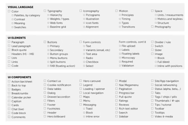
Design Systems are made up of several components that work together to create the look and feel of a product. This includes things like color palettes, typography, icons, and more. By using these components together in the same way across all products, you can create an easily recognizable brand identity that helps customers recognize your product immediately.
Using Design Systems also helps streamline the design process by providing designers with reusable components that can be quickly implemented into new designs. This makes it easier to develop new products at scale while ensuring that they meet the same high standards as existing ones.
A design system should be able to capture the essence of a brand and create a unified look and feel across all digital products.
Visual Language
Visual language is an integral part of any design system. It is the way we communicate with users through visual elements such as color, typography, layout, and iconography.
Color Palette
Color is one of the most important elements of design. It can be used to create an emotional connection with the audience and help bring our brand’s message to life. The color palette is an essential part of our design system, as it helps ensure that all visual elements are consistent and cohesive.
With our color palette, we can create a unified look. By understanding how to use our color palettes effectively, you can ensure that our designs are both visually appealing and on-brand.
Now is the time to embrace what AI can bring to design. I turned to AI today to help with the color selection for the Better World With Design website.
Primary
Better World With Design = #A1AEAB
Brand color
Secondary
#7F969D – better world
#9B857E – with design
Accent colors and Links.
Links = #75969d
Tints & Shades
Better
a8b2b1
World
698c83
With
d5d6ce
Design
beb6a
Variations colors that may be used.
Neutrals
Text
#111111 – Black
Background
#fffafa – Snow
For text and background.
Semantic
Red, Green, Yellow, and Blue (various shades and tints to match the project).
Danger
FF6347
Tomato
Warning
ffe074
Fire Bush
Success
66ac6f
Aqua Forest
Info
1a3045
Big Stone
#999999 – default
#a1a6b6 – primary
https://alexbeals.com/projects/colorize/
Glassmorphism
Tomato?
Fire Bush?
Forest
?
Big Stone?
Typography
Typography is an important part of any design system. It not only helps to create a consistent look and feel across the website or application, but also helps to communicate the message effectively.
Typography is a critical component of our design system as it provides structure, consistency, and hierarchy to the content. By using typography, our designers can create a unique brand identity for our product and service and ensure that our users have an enjoyable experience when interacting with it.
Hierarchy
Header 1
Header 2
Header 3
Header 4
Header 5 – System San Serif Font / All Caps / Bold
Header 6 – System San Serif Font / All Caps
Body Text Font.
- Source Serif Pro
- Font size 1.125 REM
- Line-height 1.6
- Appearance Regular
Weight / Type
- Header 1 – 4 – Normal.
- Header 5 – All Caps / Bold.
- Header 6 – All Caps.
- Text – regular weight.
Web Fonts
Font Family: Source Serif Pro
Headlines H1, H2 H3, H4, and Paragraph.
Font Family: System San Serif
Subheadings H5 and H6.
Spacing
Inset, inset squish, inset stretch, stack, inline, and grid — cover the vast majority of our library’s CSS rules for space: padding, margin, left, right, top, and bottom.
Padding
Margin
Gaps
Gutters
Absolute Positioning
Grid Space

Page Resources –
DESIGN PRINCIPLES – https://principles.design/
FRONTEND – https://principles.design/examples/front-end-principles-for-designers
HTML – https://principles.design/examples/html-design-principles
https://www.designprinciplesftw.com/
SPACE – https://medium.com/eightshapes-llc/space-in-design-systems-188bcbae0d62
BREAKPOINTS –
https://medium.com/free-code-camp/the-100-correct-way-to-do-css-breakpoints-88d6a5ba1862
TEST FOR VISUAL IMPAIRED – http://colorsafe.co/